The Evolution of an Identity
Sidesteps, dead ends and the continuing path towards forming an enduring brand identity.
The Concept
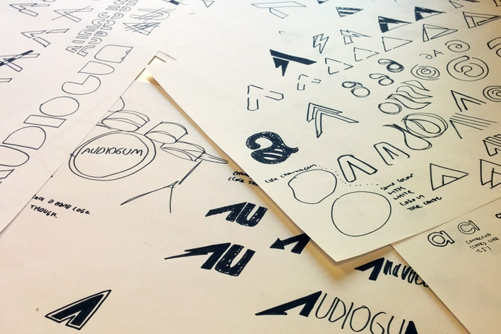
In May 2016 Audiogum was formed, but without an identity. The early concept revolved around links being made between a person and their audio devices creating 4 points, (initially a mobile, speaker, headphones and a car). When creating the Audiogum logo, we created a grid of 9 dots and the 4 points were added. Audiogum being the force that joins all the elements of your audio life ...and that gum fused the elements together create the ‘A’.

The rest of the letters in the wordmark were drawn using the same method of connected circles within the grid. Only the ‘A’ retained the visible circles.

Colour
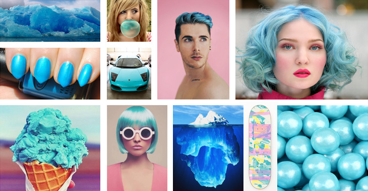
The early design concepts for Audiogum featured the bubble gum / spearmint colour heavily, which can be seen below in an early mood board.
This was in keeping with the gum part of the name and made sense to some extent, but the subtle shade of aqua didn’t really have much impact when placed in close proximity to other elements. More green was added, making more of a turquoise colour than the bubble gum aqua. This helped the logo stand out and let us use multiple colours within the connections of the ‘A’.
Instead of using the 4 circles within the ‘A’, we decided to simplify and use the area where the lines intersected to create new shapes. This reduced the number of elements with the ‘A’. Modifications to the size of the circles in relation to the grid were made to give more weight to the logo.

A secondary, all white version of the logo and the ‘A’ was created as the full colour struggled at smaller sizes and on bright or busy surfaces.
Shapes
After creating the logo, the first thing to do was break it apart and see how else it could be used. This created lots of interesting ideas but also many dead ends.

Although many of these ideas were not taken very far it made me believe that the logo was robust enough to be able to work in different situations. It would allow us enough freedom to create new assets to keep the brand fresh further down the line.
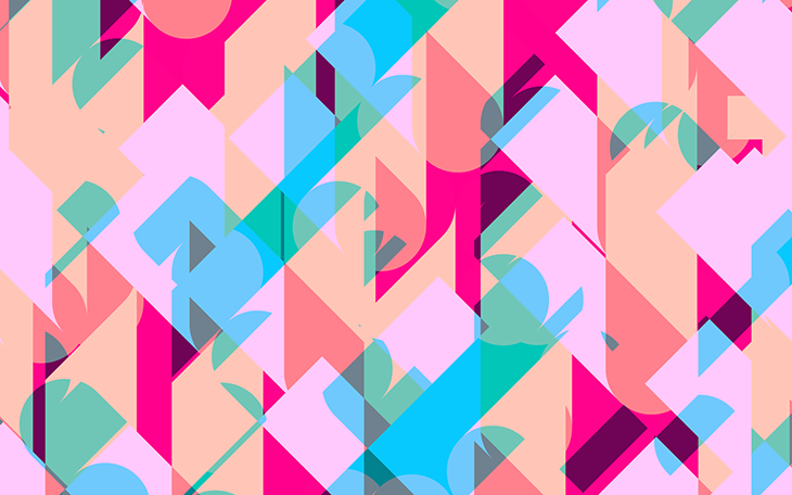
The shapes within the ‘A’, were deconstructed from the full logo. These were then arranged into a grid, again based on a group of 9. These were then placed on a larger grid at varying sizes. Each of these patterns was then rearranged creating a large pattern with no repetition. This enabled a large area to be covered easily without the eye being drawn to repeating images. A small sample of which is shown below.
This was applied to various office stationery, desktop backgrounds as well as the office design in wall murals and the glass walls of the boardroom. It was also placed in multiple arrangements on the cover of sketch books.
Shapes
So what has changed in the 2+ years since the formation of the brand? If anything, the secondary version of the logo has become the most used version of the logo. The colours of the brand remain but tend to be used as backgrounds colours as can be seen on the Audiogum website. The full colour logo would merge into these backgrounds so the white option is preferred. We find it more important to have a colourful canvas than focus on the logo itself and we like how the white works on the strong colours.
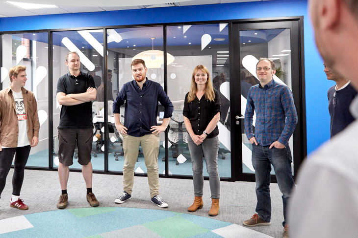
The background colours also enable us to use our thin style of iconography and illustration. Originally produced for us by the Creation marketing agency, this set has been increased by the design team at Audiogum and also appears as iconography within our apps.

We created our latest batch of brand assets in preparation for IFA, the world’s leading trade show for consumer electronics and home appliances. A strong brand identity and a stand with real impact was required, to elevate us from the many other companies that had something to shout about. Within the packed conference floor containing multiple stands, we decided to simplify the Audiogum colour palette and double down on the use of the pink and purple. A relatively small area filled with 5 competing colours might have made the space look too busy. And again, the white version of the logo was placed above most of the assets, physical and digital, which really stood out. And in case a wall of pink was not enough, an Audiogum pink neon sign was created just to make it obvious that the Gummers were in town. The team may still be having nightmares after living in (and even wearing) pink and purple for a week.
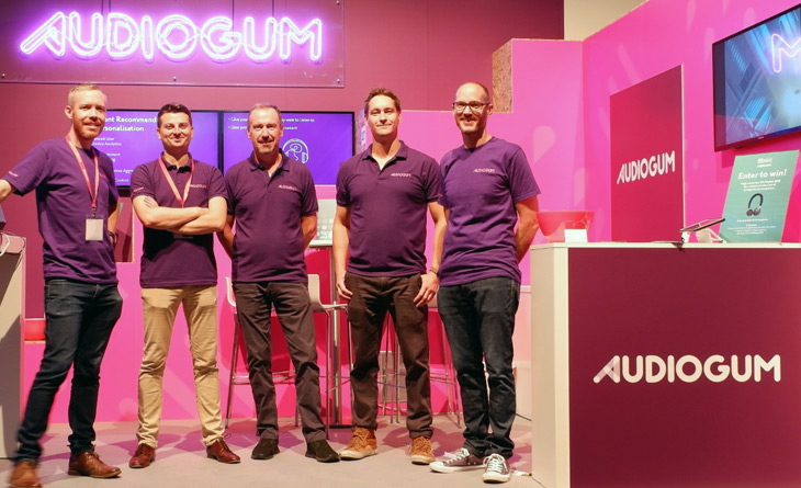
Interestingly, a neon style outline was one of the very early concepts for the logo, so it was great so see this realised over 2 years later.
The main Audiogum corporate colour turquoise was not on display throughout the stand or displayed within any of our assets, including the animated presentation, reusable coffee mugs, tote bags and more. This begs the question is it still our corporate colour or have we moved on? Is this stand a one off, created just for this event or will we return to the original colour scheme when the dust settles? Or maybe the brand is strong enough to adapt to such changes without being overly affected. Anyway, we will definitely see more of this colour scheme in the near future. Does anybody want a tote bag?